~~UPDATED BELOW~~
TIME FOR NEW BANNER... Bolder & Simplier
 Sick of my old one...
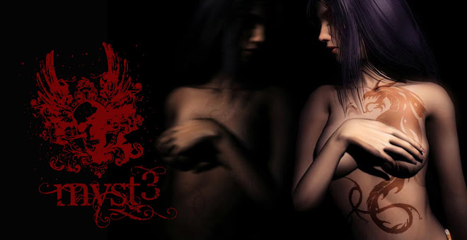
UPDATE:
Thanks for those who shared their honest opinion and suggestion.
I've thought they were a bit dark and blunt (thus hard to see).
I should have followed my 1st decision to make it upfront, bright and "in your face" effect.
Now it's brighter,
and i've let the words and skulls do the talking.
i've also changed the wording font and location a bit.
Here's it


No comments:
Post a Comment